Six Seasons Realty
In a town like Broome, you don’t just sell a "4-bedroom, 2-bathroom" house; you sell a piece of the Kimberley. The brief for Six Seasons wasn't just to look good; it was to belong.
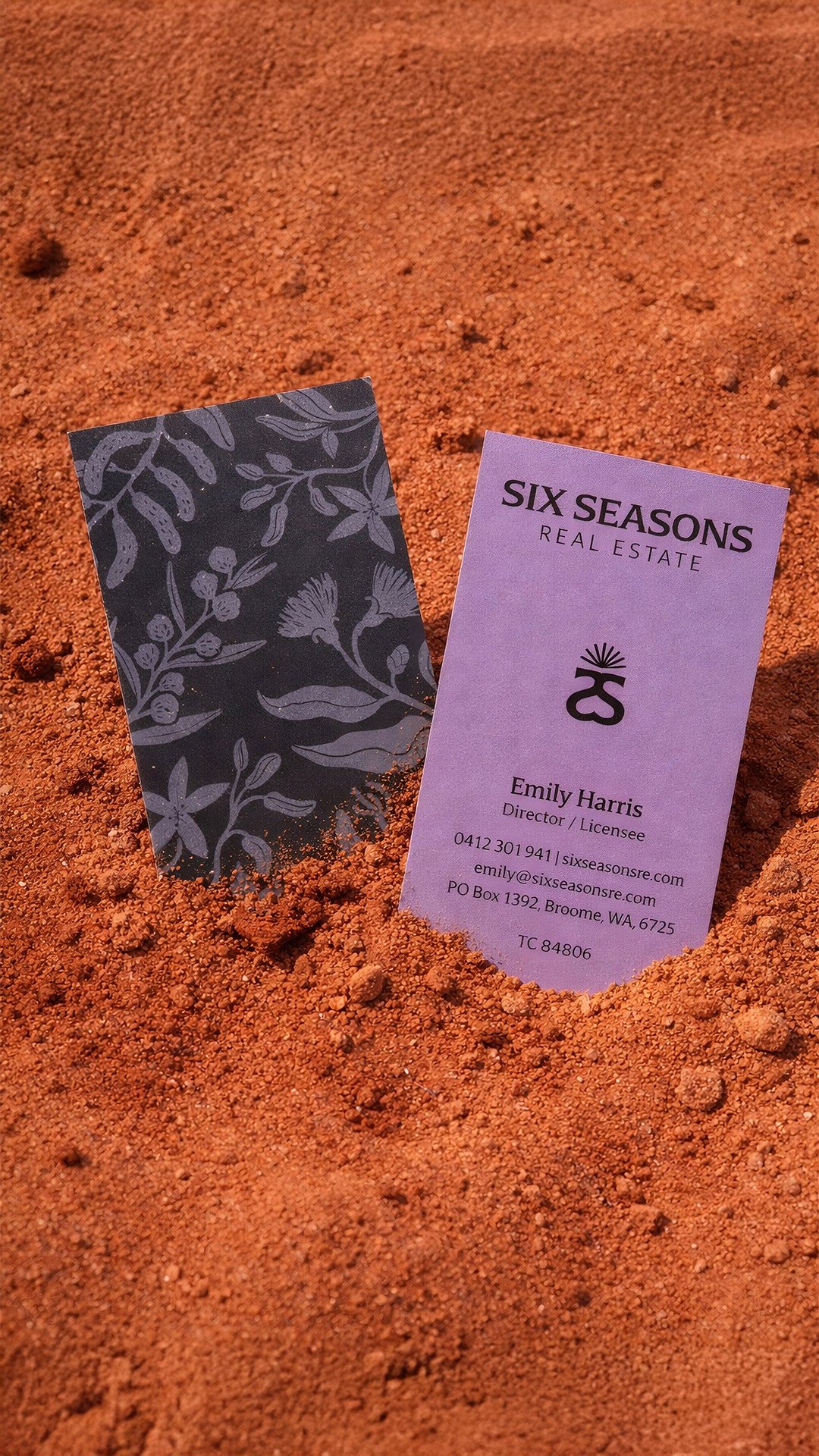
While most real estate brands default to either small-town clichés or rigid, soulless corporate templates, the identity for Six Seasons takes a different path by rooting itself in the concept of "Place." In a unique landscape like Broome, Western Australia, standing out required a brand that didn't just shout louder, but one that demonstrated a deeper connection to the soil than any competitor. Centered around a graphic, modern icon inspired by the structural beauty of the Boab tree flower, the visual identity serves as a literal anchor to the Kimberley landscape. We deliberately bypassed predictable coastal blues, opting instead for a sophisticated and moody palette of deep storm clouds and twilight hues, complemented by custom illustrations of local flora that ground the brand in its environment.
Six Seasons is now positioned as the definitive "go-to" for those who demand high-end results from an agent who truly breathes the location. By rejecting the corporate template, we created a visual language that balances local wisdom with refined luxury, signaling that Six Seasons isn't merely selling a floor plan, but the very soul of the Kimberley. This transformation elevates the agency from a standard service provider to a premium lifestyle partner, speaking directly to those lucky enough to call this rugged, beautiful corner of the world home.